A well-designed infographic can pack an impressive amount of information into a single frame, but that density is also its biggest weakness. A viewer has to actively choose to study it, and most people scrolling past simply won’t. Image to video tools solve that problem directly, turning a static infographic into a guided visual story that reveals information at its own pace instead of asking the viewer to manage that themselves. For aviation education, cabin crew training, and airline-related content, transforming infographics into engaging videos can make complex information easier to understand and remember.
Why a static infographic asks too much of the viewer
An infographic essentially hands over a finished puzzle and expects the viewer to piece it together — reading order, hierarchy, and emphasis all figured out on the fly. Motion removes that burden by deciding, on the viewer’s behalf, exactly what to look at and when.
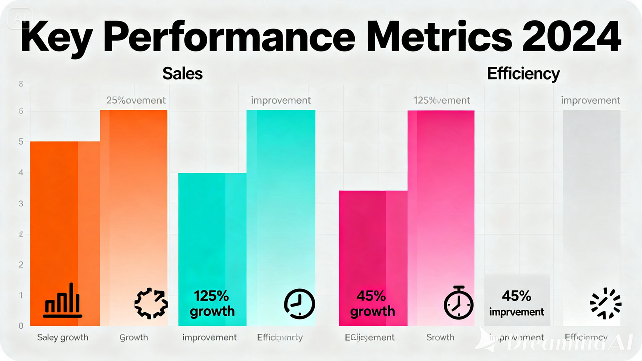
For cabin crew learners and aviation audiences, this approach helps present safety procedures, training steps, passenger service guidelines, and important information in a clearer and more engaging way.

What makes an infographic animation actually work
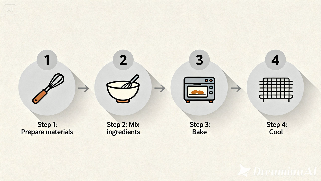
A few things tend to separate an infographic video that actually communicates from one that just looks busy. The information needs to build in a clear sequence, step by step, rather than arriving all at once. Icons and numbers should animate in an order that makes logical sense to follow along with.
The pacing has to match how much time each point genuinely needs to sink in, since rushing past important information defeats the purpose of showing it at all. Typography needs to stay legible through every single transition, not just at the start and end.
Animating your infographic with Dreamina
Step 1: Upload your infographic and describe the sequence
Log in to Dreamina and head to the “AI Video” section, then tap “Add reference image” to bring in your infographic design. From there, write out how you want the information to reveal itself.
Here’s an example for a clip:
“Using this infographic as reference, generate a 30-second video where the headline information appears first with a bold pop-in, supporting icons and visual elements built in one at a time in sequence, and the final summary line fades in cleanly at the end.”
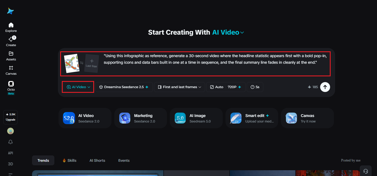

Step 2: Generate with Seedance 2.5
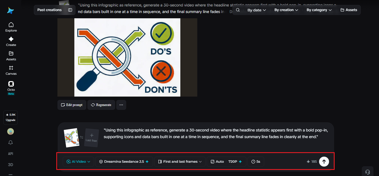
Pick the Seedance 2.5 model, choose your video length, then select an aspect ratio — 9:16 for social platforms, 16:9 for a presentation or website embed. Tap Dreamina’s generate icon and let the information take shape.
For cabin crew training content, this format can help transform static learning materials into more interactive visual experiences.

Step 3: Refine and export the finished video
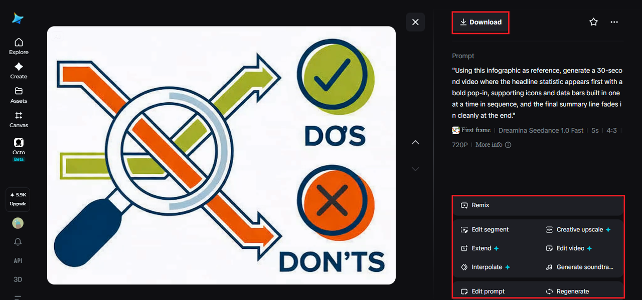
Run it through Dreamina’s editing tools first — Upscale sharpens text and icon detail, Generate Soundtrack adds a light, professional layer — then export and share it wherever the information needs to be seen.

What Seedance 2.5 brings to data-driven motion
Seedance 2.5, Dreamina’s advanced video generation model, offers the kind of controlled, sequential motion infographic content depends on.
Updates without a full rebuild
Local editing lets a single statistic, icon, or visual element get updated without regenerating the full animation, useful when new information arrives after the first version is already finished.
A complete brief, not just an image
Multimodal input support means source data or a script can guide the pacing alongside the infographic itself, giving the model a clearer sense of sequence than the image alone provides.
Crisp text through every transition
Reduced “AI look” keeps numbers, charts, and text crisp rather than blurring during motion, and unwanted elements can be removed automatically.
Ready for different audiences
Multilingual support makes it straightforward to localize the same visual story for different regional audiences without losing clarity.
Deciding which single point should lead
Every infographic usually has one piece of information that matters more than the rest, and identifying it before writing the prompt makes a real difference in how the final video is structured.
Leading with the most important information, rather than whichever point appears first in the original design, tends to hook viewers faster. The remaining details can build supporting context afterward.
Writing prompts that respect the information’s hierarchy
Spell out the order things should appear in — headline first, supporting information next, summary last. That structure keeps the animation useful instead of just decorative, since an infographic depends on how clearly it communicates.
Choosing the right length for the content
A shorter clip suits a single important point meant for quick social sharing, while a longer version works better for a multi-point infographic where each piece of information needs its own moment to land.
A few habits that make information harder to follow
Some choices tend to reduce clarity:
- Animating every element at once instead of in a clear sequence
- Moving numbers or visuals too quickly to actually be understood
- Overloading the visual with too many effects competing with the information
- Not giving the final summary enough time to register before the clip ends
Where animated infographics get the most use
Training materials, educational content, marketing reports, and social media visual stories are where this format performs best, since information that builds itself tends to hold attention and improve comprehension far more than the same content sitting in a static image.
For cabin crew education platforms like Cabin Crew Wings, animated infographics can help transform training concepts, aviation knowledge, and learning materials into visual stories that are easier for students to follow and remember.
An infographic was always trying to tell a story with information. With modern AI video tools, that story can finally unfold at its own pace, making complex topics as easy to understand as they are to view.